As 2025 draws to a close, one thing is very clear: interior design trends have shifted more in the past year than they have in the last decade. Homeowners today want spaces that feel warm, meaningful, calming, and aesthetically elevated and the easiest way to achieve that transformation is through the right wall paint colors. With the rise of biophilic design, earthy palettes, soft neutrals, and mood-enhancing combinations, 2025 became the year of expressive, personality-driven interiors.
Now, in 2026 , paint companies and interior designers worldwide are predicting what the next wave of colour evolution will look like. In this guide, we’ll highlight the top 10 paint colors that defined 2025 and will continue trending into early 2026. We’ll also explore room-wise styling ideas, interior paint colors and upcoming color directions, and expert tips to help you choose the perfect palette for your home.
How Do I Choose the Right Wall Paint Color for My Home?
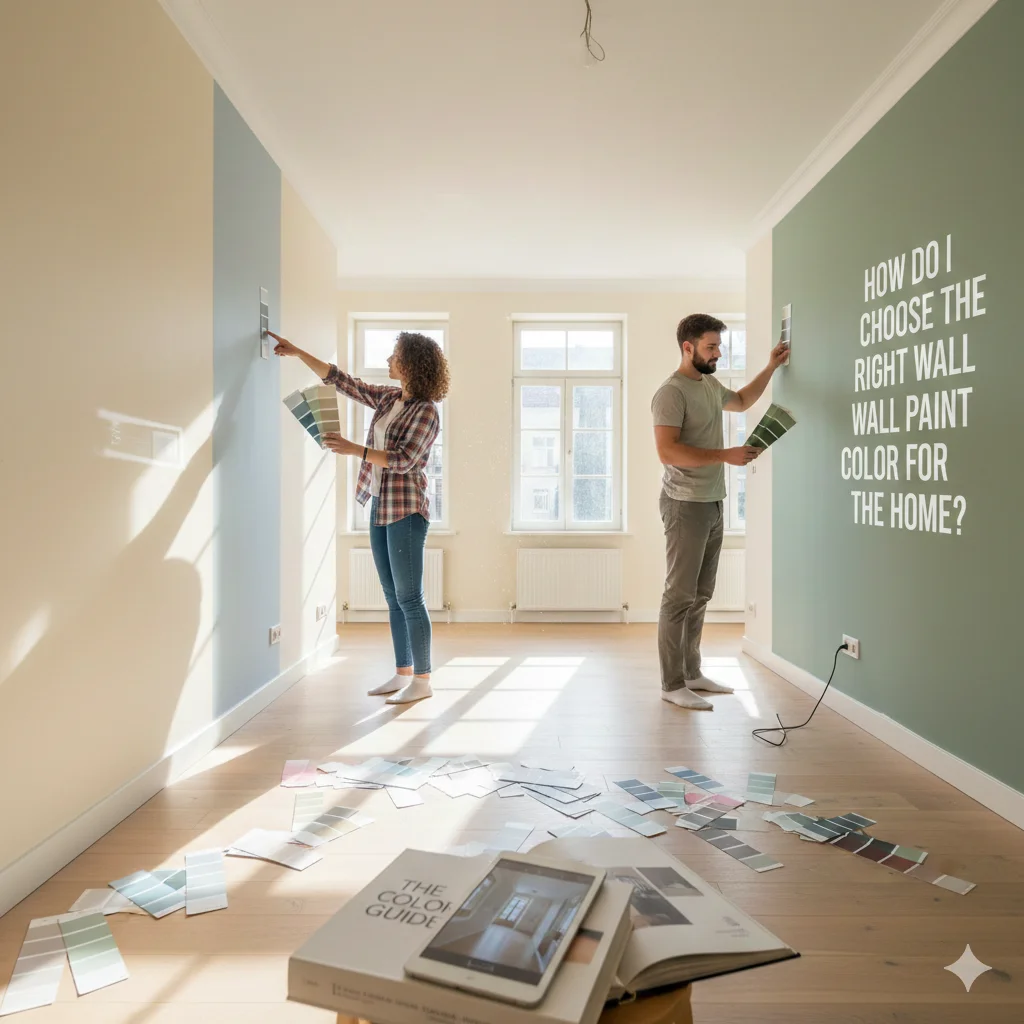
Selecting the right shade isn’t just about picking a colour you like it’s about choosing a colour that works with your space, lighting, decor style, and mood. Here’s a deeper breakdown:
1. How does lighting affect wall paint colors?
Lighting is one of the biggest factors that determine how your paint will look. Natural light brings out true tones, while artificial lighting can make shades appear warmer or cooler. A colour that looks beige in daylight may appear completely grey under LED lights. That’s why it’s essential to test swatches at different times of the day.
2. What is the purpose of the room?
Every room has a different emotion. A bedroom should feel restful, a living room should feel inviting, and bathrooms must feel clean and refreshing. Understanding a room’s use helps you select the right interior paint colors, calming greens for bedrooms, dramatic blues for living rooms, and soothing neutrals for bathrooms.
3. Why are undertones so important?
Colours have hidden undertones like yellow, blue, green, pink, or violet. Warm white may have yellow undertones, while cool white may have blue or grey undertones. If you ignore undertones, your decor may clash, making the room feel “off” even if the colour is beautiful on its own.
4. Do finishes matter?
Absolutely. Matte and eggshell finishes hide imperfections and feel softer. Satin and semi-gloss work well for high-moisture areas like bathrooms and kitchens. Textured finishes like limewash and mineral-based paints will dominate 2026 because they create depth and subtle movement on walls.
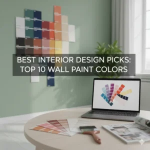
Top 10 Wall Paint Colors of 2026
These are the shades that defined the year and will continue inspiring homes in 2026. Each colour below includes ideal combinations, room suitability, and styling ideas.
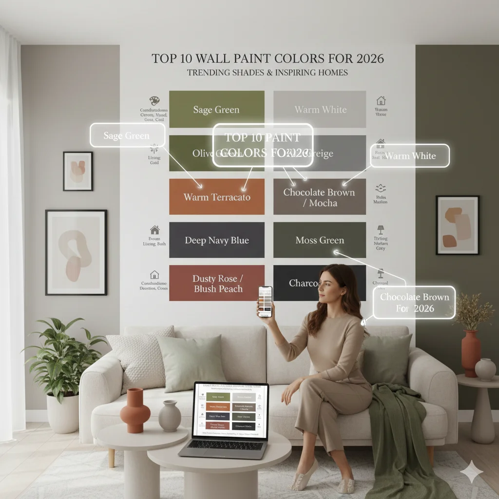
- Sage Green
- Olive Green
- Warm Terracotta
- Deep Navy Blue
- Dusty Rose / Blush Peach
- Warm White
- Greige
- Chocolate Brown / Mocha
- Moss Green
- Charcoal Black
1. Sage Green – Calm, Earthy & Timeless
Sage green dominated interior design trends in 2025 and it continues to lead conversations as we move into 2026. This versatile shade feels soft and soothing, yet sophisticated enough to elevate any modern home. Its muted, dusty undertone makes sage green one of the most loved wall paint colors because it creates a peaceful backdrop without overwhelming the space. Whether you prefer minimalist Scandinavian décor or cozy modern Indian interiors, sage seamlessly adapts to your style and enhances the natural warmth of a room.
This green wall paint paint color has an inherently grounding quality. When paired with natural textures like rattan chairs, light oak furniture, linen upholstery, or stone accents, sage green creates a spa-like calmness. It gently reflects light, making rooms feel airy, balanced, and harmonious. Psychologically, green tones are linked to relaxation and emotional well-being, making this shade ideal for spaces where you want to unwind after a long day.
Best Wall Colour Combinations:
- Sage green + warm white – Creates a clean, fresh, and bright environment. Warm white prevents the room from feeling clinical while highlighting the depth of sage.
- Sage green + natural wood – Perfect for achieving a cozy, organic feel. Wood grains add warmth and texture, balancing sage’s cool undertones.
- Sage green + beige or cream – A sophisticated pairing ideal for creating a serene, hotel-like ambience. Beige adds softness, while cream introduces warmth and light.
These combinations work wonderfully in both small and large rooms because sage green doesn’t visually shrink spaces the way darker shades do.
Perfect For :
- Bedrooms: Its relaxing nature aids better sleep and reduces visual clutter, making it ideal for bedrooms where tranquility matters most.
- Reading nooks: The color sets the right mood for unwinding, reading, or meditating, making small corners feel cozy and inviting.
- Bathrooms: Sage green pairs beautifully with matte black fixtures, brass taps, or natural stone, turning bathrooms into spa-inspired retreats.
- Scandinavian or Japandi interiors: Its muted tone aligns perfectly with the clean lines, soft neutrals, and nature-forward aesthetic of these popular styles.
2. Olive Green – Deep, Luxurious, and Rich
While sage is soft, olive is bold and dramatic. Olive green continued to gain momentum through 2025 and it’s now one of the most luxurious wall paint colors for homeowners seeking a bold yet elegant aesthetic. Unlike brighter greens, olive carries a deep, velvety richness that instantly adds character to a room. It creates a mature, grounded atmosphere and brings a sense of sophistication that stands out without feeling loud or overwhelming.
This color works beautifully in modern, vintage, and contemporary homes because it offers an earthy, organic feel with a touch of glamour. When used on an accent wall or across an entire room, olive green elevates the space, making it look more curated and thoughtfully designed. Its warm undertone pairs seamlessly with metallic accents, textured fabrics, and classic wooden furniture creating a luxurious ambiance that feels both timeless and modern.
Best Wall Colour Combinations:
- Olive green + warm white paint colors – Creates a sophisticated contrast while keeping the room airy and balanced. Warm whites soften the depth of olive, preventing the space from feeling heavy.
- Olive green + brass or gold accents – Perfect for luxury interiors. Metallic finishes highlight olive’s richness, adding a premium feel.
- Olive green + beige or mushroom tones – A modern, elegant pairing used widely in upscale homes. These muted neutrals complement olive without competing for attention.
- Olive green + black trims – Offers a modern and dramatic look, especially in living rooms and hallways.
Perfect For:
- Living Rooms: Olive adds visual drama and instantly elevates the aesthetic. Paired with warm lighting and wooden furniture, it creates a stylish, upscale ambience perfect for hosting guests.
- Dining Rooms: This color encourages intimate, cozy dining settings and works beautifully with brass chandeliers, dark wood tables, and textured fabrics.
- Bedrooms: While richer than sage, olive still has a grounding, calming effect. When used as a feature wall, it adds depth and coziness, especially with warm neutral bedding.
- Home Offices: Olive enhances focus and creativity while giving the room a polished, professional look.
- Bohemian & Mediterranean Interiors: Its earthy richness fits perfectly with terracotta pots, woven textures, rustic décor, and natural light.
3. Warm Terracotta – Bohemian Elegance
Warm terracotta made a huge comeback in 2025, and it continues to dominate earthy interior palettes as we step into 2026. This color brings an immediate sense of warmth, authenticity, and character to any room. It’s rich, sun-baked, and reminiscent of Mediterranean villas, desert landscapes, and artisanal pottery perfect for homeowners who love a blend of rustic charm and modern comfort.
Terracotta has a natural ability to create cozy, grounded environments, making it ideal for spaces where you want to feel relaxed and connected. It pairs beautifully with handmade décor, wooden textures, cane furniture, jute rugs, and warm lighting. Whether you’re designing a bohemian living room or a contemporary loft, terracotta adds depth, culture, and personality to the walls.
Best Wall Colour Combinations:
- Warm terracotta + beige
- Terracotta + olive green
- Terracotta + cream or warm white
- Terracotta + woven cane or walnut wood
Perfect For:
Living rooms, entryways, balconies, bohemian interiors, Mediterranean homes, and rustic modern bedrooms.
4. Deep Navy Blue – Moodier, Bolder, Better
Deep navy blue continues to reign as the most dramatic and luxurious choice among interior paint colors. This shade is bold yet elegant, modern yet timeless. It brings a strong architectural presence to any room, making spaces feel grounded, sophisticated, and stylish.
When used thoughtfully, especially on accent walls or cabinetry deep navy transforms a room into a high-impact, magazine-worthy space. It pairs beautifully with brass hardware, marble tops, white trims, and wooden floors. While it’s moody, it doesn’t feel dark or oppressive; instead, it creates a sense of depth and luxury that lighter colors can’t achieve.
Best Wall Colour Combinations:
- Navy blue + crisp white
- Navy blue + brass accents
- Navy blue + warm grey or greige
- Navy blue + natural wood
Perfect For:
Dining rooms, living rooms, home offices, master bedrooms, accent walls, cabinetry, and high-ceiling spaces.
5. Dusty Rose / Blush Peach – Soft and Modern
Dusty rose also known as blush peach became one of 2025’s most popular non-neutral shades, especially for modern homes. This pink paint for walls color is soft, romantic, and refreshingly modern without being overly feminine. Its muted undertone gives it a sophisticated flair, making it a perfect choice for homeowners who want subtle color that still feels stylish and warm.
Dusty rose brings a gentle glow to interiors, calming the atmosphere while adding a touch of personality. It pairs beautifully with grey, white, warm wood, and metallic accents like rose gold or brushed brass. It’s commonly used in contemporary apartments, cozy bedrooms, reading corners, and kids’ rooms but it’s now trending in living rooms too, thanks to its elegant versatility.
Best Wall Colour Combinations:
- Dusty rose + grey
- Dusty rose + cream
- Dusty rose + warm wood
- Dusty rose + rose gold or brass
Perfect For:
Bedrooms, kids’ rooms, living rooms, dressing rooms, nurseries, and soft modern interiors.
6. Warm White – A New Minimalist Classic
Warm white has become a must-have among homeowners who love minimalism but still want a cozy, livable feel. Unlike stark whites, warm white has soft yellow, beige, or cream undertones that make a room look brighter, calmer, and more inviting.
This white paint for walls is one of the most versatile wall paint colors because it complements any décor style from ultra-modern to farmhouse chic. It reflects natural light better than most colors, making small rooms appear bigger and more open. In 2025, warm white became the foundation color for many homes, and it’s predicted to remain the top minimalist pick throughout 2026.
Best Wall Colour Combinations:
- Warm white + sage green
- Warm white + grey
- Warm white + natural wood
- Warm white + terracotta accents
Perfect For:
Small rooms, hallways, living rooms, rental apartments, minimalist homes, Scandinavian interiors, and any room needing an airy makeover.
7. Greige – The Ultimate Neutral
Greige, a perfect blend of grey and beige is now considered the modern neutral of choice. It offers the sophistication of grey and the warmth of beige, making it incredibly versatile for every part of the home. Greige became a top choice for homeowners who prefer subtle, elegant interiors that never feel too cold or too warm.
Its soft, balanced undertone enhances furniture, art, greenery, and textured décor. Whether your style is modern, rustic, luxury, or minimalist, greige blends effortlessly with any palette. Designers love it because it adapts to changing light throughout the day, adding depth and character without overpowering the room.
Best Wall Colour Combinations:
- Greige + white
- Greige + black accents
- Greige + natural wood
- Greige + muted blues or greens
Perfect For:
Living rooms, bedrooms, modern kitchens, hallways, home offices, and open-plan layouts.
8. Chocolate Brown / Mocha – Warm & Cozy
Chocolate brown and mocha shades emerged as some of the most comforting interior paint colors of 2025 and they are expected to grow even more popular in 2026. These rich, warm browns bring an unmatched sense of coziness, making any room feel intimate, grounded, and inviting. Often associated with warmth, stability, and comfort, chocolate tones help create a space where people naturally want to relax and unwind.
Mocha, with its lighter creamy-brown undertone, offers a softer, more contemporary take on classic chocolate shades. When paired with warm lighting, textured fabrics, brass décor, or wooden accents, these colors completely transform a room into a luxurious retreat. Whether used for accent walls or full-room coverage, chocolate brown and mocha add depth without overwhelming the space.
Best Wall Colour Combinations:
- Chocolate brown + warm white
- Mocha + beige or cream
- Chocolate brown + brass or gold
- Mocha + natural wood + off-white fabrics
Perfect For:
Media rooms, bedrooms, study rooms, living rooms with warm lighting, rustic interiors, contemporary homes, and cozy reading corners.
9. Moss Green – Perfect for Spa-like Calm
Moss green is emerging as one of the most restorative wall paint colors, ideal for homeowners who want to bring a sense of calm and nature indoors. While sage and olive have dominated the trend charts, moss green offers a deeper, richer alternative that still feels serene and spa-like. It’s inspired by forest floors, natural textures, and earthy landscapes making it perfect for wellness-focused homes.
This shade works incredibly well with stone, bamboo, cane, linen, and matte black fixtures. Moss green doesn’t just visually calm your space, it psychologically encourages relaxation, grounding, and mindfulness which explains why it became a top pick for bedrooms, bathrooms, meditation corners, and spa-inspired interiors in 2025.
Best Wall Colour Combinations:
- Moss green + cream
- Moss green + matte black fixtures
- Moss green + light wood
- Moss green + beige or taupe
Perfect For:
Bathrooms, bedrooms, meditation corners, spa-like spaces, reading nooks, eco-friendly homes, and Japandi interiors.
10. Charcoal Black – Modern & Dramatic
Charcoal black has evolved into one of the most striking and modern choices among interior paint colors. Unlike pure black, charcoal has softer undertones often grey, blue, or brown which give it greater depth and sophistication. This makes it ideal for homeowners who want a bold, dramatic, and high-impact look without the harshness of true black.
It instantly adds luxury, contrast, and architectural definition to a room. Charcoal works beautifully on accent walls, behind TV units, in dining rooms, home offices, and even bedrooms when paired with warm lighting. It also complements metal finishes, stone textures, wood furniture, and abstract décor like black and white abstract painting. The result is a modern, gallery-like ambiance that feels polished and upscale.
Best Wall Colour Combinations:
- Charcoal black + warm white
- Charcoal + brass or chrome
- Charcoal + grey or greige
- Charcoal + natural wood for a warm, balanced finish
Perfect For:
Accent walls, living rooms, home offices, modern bedrooms, industrial lofts, hallways, and spaces with abundant natural light.
Wall Paint Colors in Action: Mastering the Combination
Choosing the top 10 interior paint colors is only the first step; combining them correctly is what achieves a professional finish.
The golden rule designers follow is the 60-30-10 Rule. Your primary colour (usually a neutral paint colors choice like warm white or greige) covers 60% of the space. The secondary colour (30%, perhaps grey wall paint or dusty blue) is for feature walls or upholstery. The final 10% is the bold accent (a cushion, a vase, or deep navy on a front door).
To create design flow, use a consistent, light neutral to connect all the rooms, particularly in hallways and landings. This connects the entire home and allows you to use stronger room colour combination palettes in the private spaces. For a relaxing bedroom colour combination, balance a deep accent (like navy) with a soft neutral like warm white paint colors or a muted sage.
Room-Wise Wall Paint Color Recommendations
1. Bedroom Color Combination
In 2025 and moving into 2026, bedroom wall colour combinations focus on creating restful yet characterful spaces. Popular bedroom paint colors include warm, earthy tones like dusty sienna and warm clay beige, paired with calming pastels such as digital lavender and muted rose. Designers are shifting from stark whites to softer, creamy whites and warm neutrals that add personality while maintaining tranquility. Deep plum and muted coral shades are also in vogue, adding a touch of sophistication or warmth.
2. Living Room Paint Color Combination
Living rooms are embracing richer, nature-inspired palettes. Considering best paint colors for living room are Soft olive green remains a favorite alongside new trends like weathered clay, cinnamon spice, and warm eucalyptus greens. These greens bring a grounded feel and pair well with neutral paint colors such as warm white and warm clay beige. Charcoal gray and midnight blue are increasingly popular for accent walls, offering dramatic depth without overwhelming the space. Jewel tones layered with neutrals create inviting, layered interiors.
3. Bathroom Paint Color Combination
The bathroom trends for 2025 and 2026 lean towards calming blues and atmospheric teals, sky blue, light teal, and quietude shades create spa-like serenity. Muted and soft blues are complemented by warm neutrals like creamy whites and neutral paint colors, yielding balanced and fresh looks. Small doses of darker colors like oiled bronze or charcoal slate in trim or niche areas offer sophisticated contrast.
4. Best Colour Combination for Hall
Hallways in 2025 and 2026 trend towards layered neutrals with more warmth and depth compared to the cooler “millennial gray” of previous years. Universal Khaki, warm white shades with chalk and raw linen undertones, and soft, earthy browns like reddened earth or cordovan dominate. These colors create welcoming transitional spaces that feel cozy yet elegant. Accent niches with oiled bronze or deep jewel tones such as plum add personality without disrupting the flow.
2025 Color Palette vs. 2026: What’s Changing and What’s Staying
The 2025 Palette – What Defined the Year
In 2025, the interior design world leaned heavily into an earthy, grounded, and warm palette a clear reaction to years of ultra-bright minimalism. Key themes included:
- Nature-inspired tones: Greens like sage and olive, terracotta, and clay were everywhere. These shades evoked a sense of calm, rootedness, and connection to the outdoors.
- Warm neutrals: Creamy whites, camel beiges, and greige (a balanced mix of grey + beige) dominated walls and large surfaces. These hues acted as both canvases and anchors, allowing accent colors to shine.
- Rich, moody highlights: Deep navy, chocolate brown, and warm black brought depth and sophistication. Instead of flat greys, designers leaned toward expressive, cocooning colours.
- Soft pastels: Muted pinks and dusty peach made subtle appearances not as bright candy tones, but as soft, romantic accents that felt modern and mature.
Overall, the 2025 colour story was about comfort, authenticity, and emotional warmth creating spaces that felt personal, calm, and deeply human.
What’s Evolving (and What’s Coming) in the 2026 Palette
As we turn toward 2026, the colour landscape is shifting subtly. Designers and paint experts foresee a natural evolution rather than a sudden overhaul many of 2025’s favourites will stick around, but with richer, deeper, or more expressive versions. According to multiple sources, here’s what’s trending for 2026:
- Jade & Blue-Greens as the New Neutrals
- Behr’s 2026 Colour of the Year, Hidden Gem, is a smoky jade / blue-green that’s being called a “new neutral.”
- This shift shows how muted greens are maturing they’re no longer just calming, they’re statement-making, yet versatile.
- These hues work beautifully with natural materials like rattan, white oak, brass, and linen reinforcing the trend toward organic, wellness-focused design.
2. Earthy and Grounded Browns
- The “Heirloom” palette from PPG includes rich heritage browns and mahogany tones, reviving the warmth and character of classic interiors.
- Glidden is also pushing Warm Mahogany, a deep, moody brown that blends red and brown undertones for a luxurious, comforting feel.
- These colours bring a sense of tradition, stability, and timelessness, but feel very much of-now in 2026.
3. Drama with Moody Darks & Jewel Tones
- Beyond just neutral or natural, 2026 is embracing deep charcoals, smoky teals, and moody blues as accent shades. These tones are bold but not brash, they ground a room while allowing textures and features to shine.
- According to color experts, there’s a “craving for warmth,” but also for expressive, layered palettes that feel both comforting and luxurious.
- These darker colors work well in sophisticated, intimate spaces, think reading nooks, accented ceilings, or library walls.
4. Soft, Muted Pastels Reimagined
- Designers are bringing back pastel shades, but with a more refined, muted edge: think dusty rose, lavender-grey, sage-toned greens, and delicate blush.
- These aren’t playful or loud; instead, they give softness without forfeiting design seriousness.
- Combined with warm neutrals or richer accent colours, they help to balance the richness in 2026’s palette.
5. Expressive & Layered Palettes
- Paint companies are leaning into curating multi-tone “stories” rather than single standout shades. For example, PPG’s “Collective” trend blends drama (dark shades), lively brights, and pastoral neutrals to build layered, personality-filled interiors.
- The idea is to use colour not just as a backdrop, but as a means of emotional expression allowing spaces to feel personal, curated, and balanced.
| 2025 Trending Color Palette | What’s Out in 2026 | Why It’s Changing |
| Sage Green | Cool Mint Greens | Warmer, earthy tones are replacing cooler pastel greens. |
| Olive Green | Lime & Neon Greens | Homeowners prefer deeper, grounded natural hues over flashy brights. |
| Warm Terracotta | Bright Orange Shades | Muted, clay-like tones feel more organic and soothing. |
| Deep Navy Blue | Pure Royal Blue | Designers are shifting to moodier, darker blues for luxury appeal. |
| Dusty Rose / Blush Peach | Barbie Pink & Hot Pinks | Soft peachy tones offer subtle elegance over loud pinks. |
| Warm White | Stark, Cold White | Warm whites create cosier, more welcoming spaces vs. clinical whites. |
| Greige (Grey + Beige) | Flat Cool Grey | Grey is evolving into greige for warmth and depth. |
| Chocolate Brown / Mocha | Pale Beige | Darker, cocooning browns bring richness versus washed-out neutrals. |
| Moss Green | Emerald Green | Softer greens with earthy undertones feel more timeless. |
| Charcoal Black | Jet Black | Softer blacks offer the drama without making spaces feel harsh. |
Conclusion
As we move from the warm, grounded palettes of 2025 into the more expressive, layered color stories of 2026, one thing is certain: wall paint colors are no longer just decorative, they’re emotional, atmospheric, and deeply personal. Whether you’re drawn to calming greens, cozy browns, soft pastels, or dramatic darks, the future of home interiors is all about creating spaces that reflect who you are and how you want to feel.
With wellness, comfort, and individuality at the core of next year’s trends, 2026 encourages homeowners to experiment confidently, blend textures and tones, and craft rooms that feel warm, inviting, and beautifully lived-in. The right colour palette doesn’t just refresh your walls, it redefines the energy of your entire home.
FAQs
1. Which wall paint color is best for Indian homes?
Warm neutrals like warm white, greige, and beige are the most versatile for Indian homes because they work well with natural light, wooden furniture, marble floors, and colourful décor. Earthy greens and terracotta shades are also trending for their calming and stylish appeal.
2. What wall color makes a room look bigger and brighter?
Light colors such as warm white, cream, pastel peach, light grey, and soft sage green make small rooms appear larger and more open. These shades reflect natural light effectively, creating an airy and spacious feel.
3. Which color is best for a bedroom wall?
Calming shades like sage green, dusty rose, lavender-grey, warm beige, and soft blue are ideal for bedrooms. These tones create a relaxing atmosphere and promote restful sleep.
4. How do I choose the right paint finish for my walls?
For most rooms, matte or eggshell finishes work best because they hide imperfections and give a smooth look. Satin or semi-gloss finishes are ideal for kitchens, bathrooms, and high-moisture areas due to their durability and easy cleaning.
5. What are the trending wall paint colors for 2026?
2026 trends include smoky jade, warm browns, moss green, charcoal black, dusty pastels, and richer navy tones. These color palettes focus on warmth, depth, wellness, and creating cozy, expressive living spaces.